YouTube has long maintained its own design language that sets it apart from other Google apps. YouTube for Android is now testing a somewhat notable redesign that replaces the Library tab with “You.”
This test sees YouTube remove your profile avatar in the top-right corner and move it to the bottom bar. It serves as the icon for a new “You” tab that combines the functionality of the previous account menu and Library. All Google apps have that account pic in the same position, and this YouTube redesign breaks that consistency. It’s somewhat reminiscent of Instagram and other social media apps, which might be the point (see: Shorts).
Your channel information appears first along with buttons to Switch account, Google Account, and Turn on Incognito. App settings are accessed from the gear icon that only appears on this page, and is faster to access than before.
Next are carousels for History and Playlists, with the latter no longer being a continuous list for a big usability change that reflects how this is no longer a Library page. That said, it could be argued that it’s less important for the main YouTube app to have one than YouTube Music or TV.
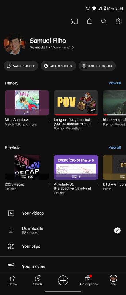
Your videos, Downloads, Your clips, Your movies, Your Premium benefits, Time watched, and Help & feedback round out this page.
We only have one report today of this You tab replacing the YouTube Library.
If YouTube proceeds with the redesign, it would further branch off from other first-party apps. YouTube maintains everything from its own font to icons. At this point, it’s likely not getting a Material You bottom bar — tall or otherwise.
More on YouTube:
Thanks, Samuel
FTC: We use income earning auto affiliate links. More.