Four years ago, the ReMarkable 2 arrived and changed my writing life.
This ultra-thin, silver-framed e-ink screen, which I still think of as a legal pad from the future, helped me kickstart a handwritten diary I’ve kept up nearly every day for the last two years. I use its Marker in calligraphy pen mode, which has an aesthetic appeal even the mighty iPad can’t match. Plus, the older I get the more I feel the joy of e-ink, tech’s most soothing alternative to all that LED screenlight blasting our faces.
So when Norwegian tablet maker ReMarkable handed me the device it’s been working on ever since 2020, the Paper Pro, you can bet my peepers went wider than a side-eye emoji.
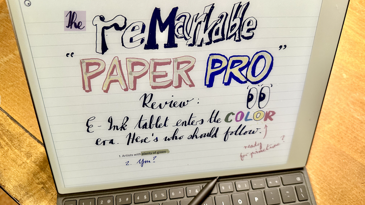
A bigger screen? A backlight? A redesigned Marker where the nib doesn’t wear down as frequently? Half the lag (that milisecond-measured gap between nib touching screen and e-ink appearing) of the ReMarkable 2, where the lag was already impressively low? And a range of colors, not just black and grey? Yes, yes, yes, yes, and yes please.
The ReMarkable Paper Pro also updates the keyboard folio, an optional extra I’d been toting around with the ReMarkable 2 for the past couple of years but not actually used that much: the typing lag felt a tad too long, the text column was too narrow, the keyboard wasn’t backlit. The Pro folio fixes all those problems, and it comes with a nice little wrap-around magnet that helps lock the Marker in place.
Was this, finally, the perfect distraction-free device for writers I’d dreamed of for a decade?
The Paper Pro isn’t perfect
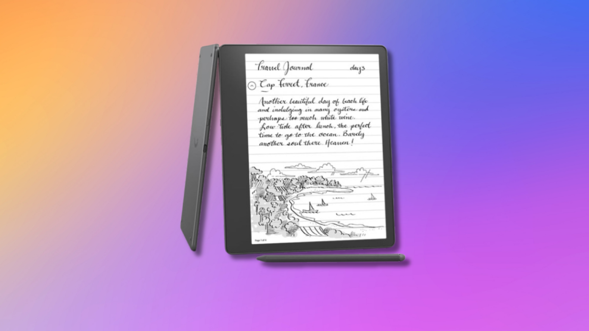
After testing the Paper Pro for a week, I’m less enthused. It has some issues, though not enough for me to stop using it. Still, I can see why ReMarkable will continue to sell the $399 ReMarkable 2 ($449 with the more sensitive Marker Plus) alongside the Paper Pro ($579; $629 with Marker Plus; add a $199 keyboard folio and you’re talking serious scratch for any e-ink machine).
For many users on tighter budgets, the ReMarkable 2 will remain a superior choice.
I’m also surprised to find that the two devices don’t play well together. The Markers are not swappable. You can sync documents between machines using ReMarkable’s Connect service — but a document started on the Paper Pro’s 11.8-inch display will spill over the sides of the ReMarkable 2’s 10.8-inch screen.
Essentially, ReMarkable is creating a technology fork, asking you to choose one device or the other.
If you take the Paper Pro path after traveling with ReMarkable 2, you might hit some bumps in the transition. You won’t necessarily notice the new one is heavier (by 0.17 lbs) since the weight is distributed in a larger form. You may notice it’s a few hairs thicker, even though the Paper Pro’s ridged sides are pleasant to touch. You will probably find that the screen-nib combination is more slippy on the Paper Pro, a little more like the smooth glass feel of writing on an iPad. I simply tap the screen harder at the end of sentences, period.
Also your mileage may vary on this one, but I felt that the basic black color you’ll use for writing most of the time looks a little more washed out, from certain angles, on the Paper Pro screen. This could be the fault of the new backlight, which does the job but has an ethereal, slightly uneven glow around the edges of the screen, and which I found myself turning off as often as possible, for the sake of the battery (which, as you might expect, seems to run out a little faster on the Paper Pro.)
Or it may have to do with the fact that black isn’t actually black on the Paper Pro: it’s yellow, cyan and magenta all smooshed together.
Paper Pro Color: a (fun) work in progress
Left: How my heart drawing looks on the screen. Right: How it looks in PDF form.
Credit: Chris Taylor / Mashable
Technologically speaking, the Paper Pro is an impressive leap forward. Taking e-ink from monochrome to CMYK is no mean feat, considering the ink actually sits there in a real layer under the screen glass. Combinations of cyan, magenta, yellow and white give you a second set of options — black, red, blue, green — and by layering all those colors on top of each other, you can get thousands.
In theory, at least. In practice, you’ll see several bumps on the road to color. First off, there’s the fact that when you lift the Marker from the page for a second, anything you’ve just handwritten or drawn in color (you can’t type in color yet) has to refresh. Even if you’re just writing in blue pen rather than black, that bit of the screen you’ve just changed flashes on and off a few times, very quickly.
The flashing looks a bit weird at first, like your ink can’t decide whether it’s invisible or not, like your words aren’t secure in their own existence. Still, I was surprised to find I stopped noticing it after a while.
There’s a larger color problem, and you can see it in the screenshots above where I made my first-ever e-ink color drawing — a fanciful anatomy of a human heart — using the Marker’s brush and pen settings. What you’re drawing on the screen is subtle, like pastel colors. But when you send the image (you can email your ReMarkable output with or without turning your handwriting into text), the PDF will show far more intense, almost cartoonish primary colors.
In other words: yes, you can dither your way to interesting color combinations, but the Paper Pro screen won’t give you the clearest image of what you’re actually creating. Color e-ink is something of a work in progress, and ReMarkable will continue to tweak the software with updates every few weeks. But it’s hard to see the company getting around this fundamental divide between e-ink content and a LED screen world.
Are you a Paper Pro kind of pro?
Which leads us to the question: For whom was the ReMarkable Paper Pro made? Artists and designers may enjoy playing around with it, but the color representation problem means they’d be better off using an iPad for serious work. If you just enjoy distraction-free handwriting and typing, you may be better off buying a monochrome ReMarkable 2, and keeping an extra $180 in your pocket.
The core audience for ReMarkable, if Reddit enthusiasm is anything to go by, is students and knowledge workers.
The Paper Pro is for taking and highlighting notes — ReMarkable has taken pains to ensure the highlight moves with the text it’s highlighting, no matter how the rest of the page changes — and sketching out new ideas on the fly. Medical and engineering students will have uses for that color. IT departments will like the new six-digit PIN security; I liked the four-digit PIN because that’s all I needed to keep prying eyes out of my diary, but I’m not the target audience here.
Then again, my casual color sketching style, where I care more about having fun than true colors, is a nice fit for the new device. I might be more inclined to reach for it, when I feel the urge to make art, than fire up Procreate on my iPad.
The ReMarkable 2 changed my writing life; perhaps the Paper Pro will change my art life.


