Nobody wants to hear they’re outdated… stale… or old. That’s exactly what we had to face, though. Throughout the days, months, and years, our Help Center, where we keep up to date articles about Buffer for our customers, had become just that.
Don’t get me wrong, there’s a ton of great content in there. That’s the problem, though. There’s just too much, and the content has started to become less and less reflective of Buffer: the product it is meant to support.
There are four of us on the team working on the Help Center, which is part of our larger 21-person Customer Advocacy team. We know we can’t just go in and edit each article as it stands. The change required is deeper than that. It requires us to rethink the entire structure, from our top categories, to how we merge and split articles, how we support our articles with visual content, and finally, how we present our article content in a clear and simplified way.
We’re right in the middle of the process to fully overhaul (or, “revamp,” as we like to call it) the 216 articles in our Help Center. In this post, I’ll explain how we’re confronting this project to avoid what could otherwise feel like an overwhelming initiative.
There are two main reasons we might seriously consider a project this big:
- Our customers are no longer being served by our content, recognized by unsuccessful searches or direct feedback;
- We don’t believe the experience in the Help Center has evolved with our product.
For this change, we‘ve seen a bit of both.
On the customer side
We discovered through our use of Algolia that some basic search terms didn’t lead customers to the right articles.
We also found that the integrity of our information lacked in some areas, with some instances of conflicting information. This was due to multiple articles crossing over the same topic, but when that information changed, only one or two of the instances were updated.
Lastly, customers told us that our content wasn’t hitting the mark. Simple as that.

Ouch.
On the product evolution side
If you’ve been a Buffer customer for a while, you might have noticed some changes over the years. We continually evolve our product to better meet our customers’ needs. However, while we furiously updated our Help Center content, its unchanging organization grew further away from what our product looked and felt like.
Related, with the intention to meet the needs of all customers, we neglected the majority use case. We stocked our articles full of every nuance and use case we could think of, leading to very strong, but overwhelming articles.
This was in direct opposition to what we strive for in our product: clean design and simplicity of use.
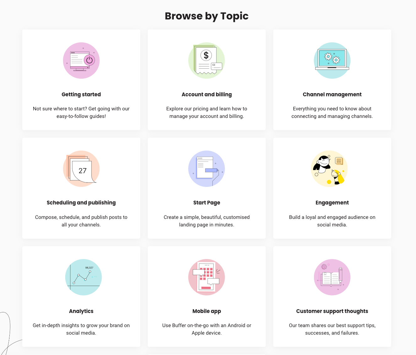
While it’s important to get into the finer details and edit each article, it’s also important to zoom out to see how all of those articles are organized. We knew we needed to fully rethink the highest-level topics presented on our Help Center so they more closely matched our product experience.
Taking some great advice from our Senior Design Manager, Martin Gloeckle, here at Buffer, I started researching the Card Sorting exercise.
The Card Sorting exercise is a way to invite others (customers, employees at your company, a focus group, etc.) to lend advice on how to organize your website, shop, or in this case, Help Center. After doing some research and several internal discussions, I went forward and launched an open card sorting exercise internally.
There are several ways to conduct a card sort, but in our case, we used the Open Card Sorting method. I created 70 digital cards, each with the name of one Help Center article on it. As I mentioned before, we have 216 articles in our Help Center, but I chose 70 that I believed were representative of our content.
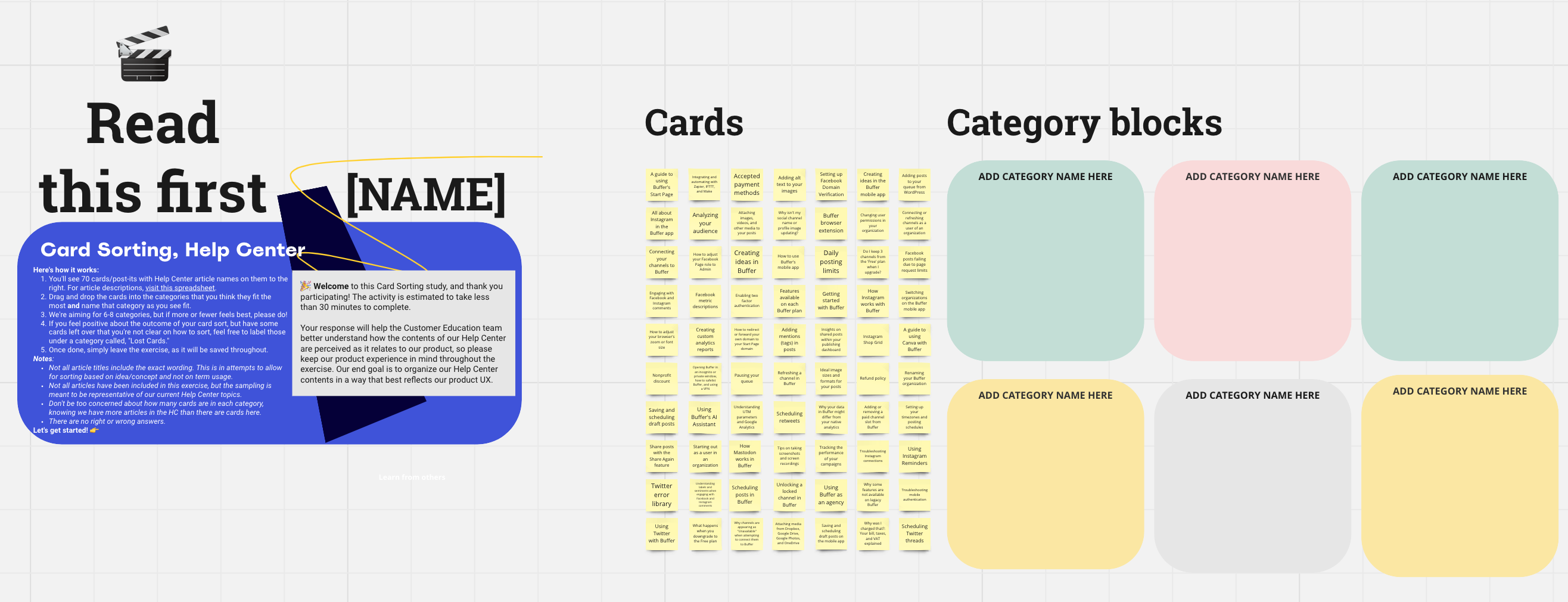
I then found 11 volunteers, willing to take time alone to each sort the cards (a.k.a. articles) into categories that they named.
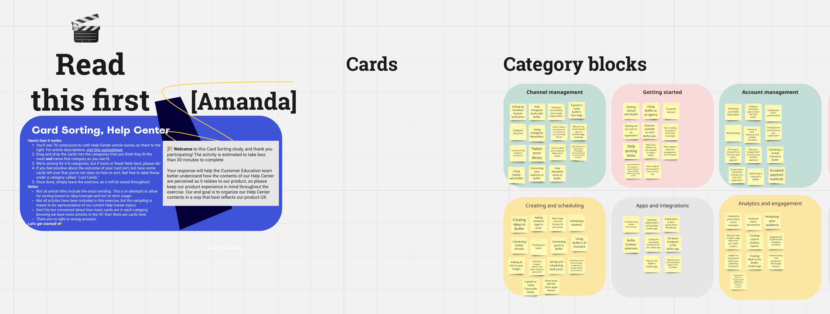
I’m currently in the middle of sorting through the data that came in from our 11 participants. I look forward to giving you an update on how it went in the follow up piece I’ll write after we complete this project.
When confronting this initiative, it was clear from the start that we wouldn’t get too far by putting our articles on a metaphorical conveyor belt, splicing and zhuzhing until they perfectly aligned with the look and feel of our product.
This would make each individual article feel great, sure, but it wouldn’t have any affect on how easy it is for visitors to navigate Buffer’s self-help.
Instead, I took the time to look at every article and group it into one or two categories that fit the job-to-be-done (JTBD), such as post creation or scheduling posts, or the topic, such as Instagram or the browser extension. This creates specific groups. From there, I assigned each group of articles to one of the two Help Center contributors working on this project.
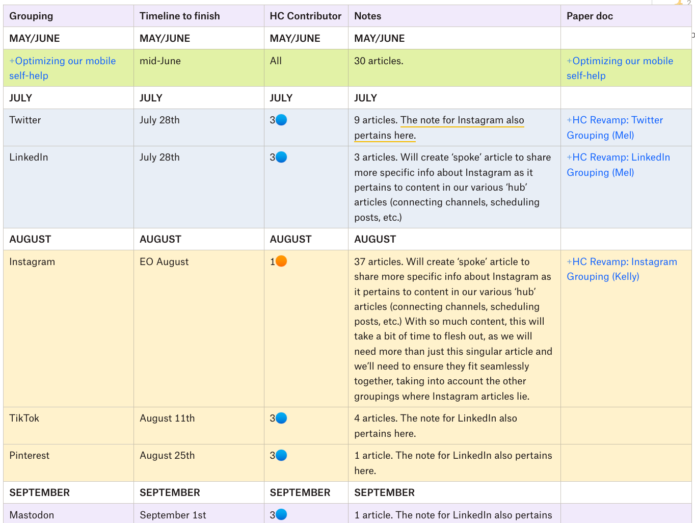
When it comes time to plan for the next topic group, the assigned team member and I meet to discuss all of the related articles on that topic and to start organizing a way forward.
These are a couple of questions we ask ourselves:
- Should any of this content be merged to reduce our number of articles?
- Which information is redundant?
- Which information is essential to a customer’s success?
- Should any articles in this grouping be created or archived?
- Is the information accurate?
- Are we telling a clear and accurate story?
It’s messy.
This process isn’t one of those that makes you feel like a rockstar. Instead, you kind of start by tromping around in the mud, and as you continue talking and pondering, you slowly wade yourself out.
So, that’s it. Out with the old and in with the revised (that’s the saying, right? 🙃)
I’ll have more information and will share our learnings in another article once we get further along in this project; I look forward to sharing it with you in a few months.
But first, I’d love to hear from you. Have you tackled a messy, but necessary project like this one? I’d love to learn from you in the comments below.


