In our article on the best type of content to post per platform, we discovered something interesting: LinkedIn carousels get the third highest engagement after videos and images.
Perhaps more interestingly, we also discovered that LinkedIn is the social media channel where we saw the smallest difference between the various media types. For example, video posts only ranked 0.1 percent higher than photo posts, and photo posts were only 0.4 percent higher than PDF carousels.
The timing of this discovery coincided with our introduction of PDF carousel uploads in Buffer, so I thought: why not test out LinkedIn carousels as a content format? I’ve succeeded with them before but never kept them up consistently – what would happen if I did? That’s how this experiment was born.
In this article, I’ll explain my reasoning, process, and results for posting PDF carousels daily for six days to my LinkedIn profile.
Why LinkedIn carousels?
LinkedIn has an interesting history with the carousel content format. They first introduced them as PDF uploads in 2019. Then, they made it a standalone beta feature that only certain users could access in 2022. Finally, in December 2023, they sunsetted the beta feature, leaving PDF uploads as the only way to upload carousels.
Despite the ups and downs, the format is one of the most popular on LinkedIn as they are
- visually engaging, leading to more time spent on a post
- increase the likelihood of engagement
- are prioritized in the LinkedIn algorithm
I personally enjoy engaging with them, as different creators have unique design elements that have inspired my content.
This experiment will hopefully show that LinkedIn carousels don’t have to be too labor-intensive, as well as highlight the value of investing in them.
The content creation process for a week of carousels
Finding inspiration
I took inspiration from creators like Sam Browne and Lara Acosta.
Both have very recognizable formats and structures for their content, which encourage you to stop scrolling and swipe through.
Choosing one tool (and one structure)
My tool of choice was Canva, where I created a template to duplicate and repurpose for my different content ideas.

Some elements from my LinkedIn carousel template
Doing this helped me stay consistent, as I didn’t have to worry about design or fonts – just the content of each slide.
Content themes
I’ve set certain expectations for my audience on LinkedIn, so my content themes followed through on them. My content is usually centered around personal branding, content creation, content marketing, and remote work. The carousels I published were all some version of that.
Experiment criteria
My focus for this experiment was watching the performance of carousels against my usual format of texts and the occasional image.
I was inspired to do this when Mitra, Buffer’s social media manager, pointed out that LinkedIn carousels actually record such high results because LinkedIn counts scrolls through PDF carousels as impressions.
It looks like clicking through a carousel counts as an engagement on LinkedIn, which is why carousel posts tend to have a higher engagement rate for us than static image posts or text-only posts.
– Mitra Mehvar, Social Media Manager at Buffer
I wanted to see what would happen if I invested a week in carousels – would they produce the same results?
Spoiler: Prior to this experiment, I had been publishing fairly consistently (almost every day) on LinkedIn, but nothing has produced the same results as the week of carousels.
The experiment
Post 1
- Impressions: 1,400
- Engagements: 34
This post was inspired by my time on the Buffer retreat that led to me reigniting an old passion. The carousel was focused on how I wanted to kickstart that hobby again. It’s a more personal post and less practical, but it received a fair amount of engagement and comments from people curious about how I’d approach it or making suggestions for my content.
Post 2
- Impressions: 3,085
- Engagements: 134
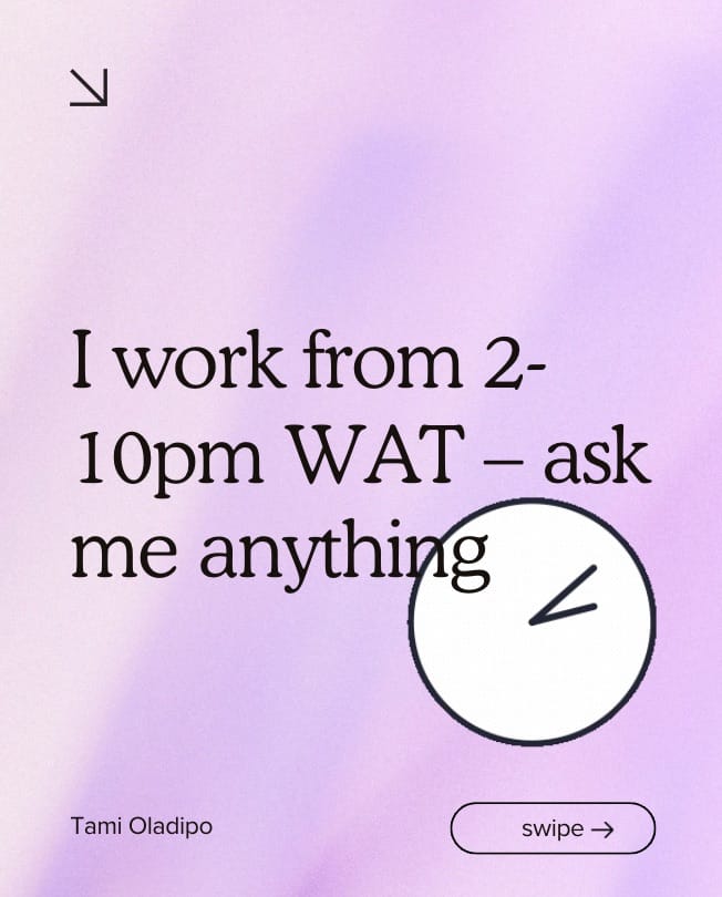
In contrast to the first day, the second post had the highest engagement rate of any post I made with over 103 reactions and 31 comments. The post was focused on my unique work schedule and the conversations it sparked were around productivity and different working styles. The relatability of the post probably inspired a lot of the engagement.
Post 3
- Impressions: 2,089
- Engagements: 55
This post was inspired by Mitra, who mentioned that it’d be fun to see Instagram-style posts on LinkedIn. I thought it’d be a unique spin on the typical LinkedIn content, and the results proved my instincts were right.
Post 4
- Impressions: 1,654
- Engagements: 38
This was the first of three times I tried repurposing old content. This post was based on one tip from a recent article on Instagram ideas for B2B companies where I expanded on examples for the main tip I had shared. Repurposing is a game-changer for saving time and the visual element of screenshots combined with practical advice led to the highest number of reposts for any of the carousels I posted.
Post 5
- Impressions: 881
- Engagements: 19
This was the second of three repurposed posts, now based on an old carousel I had shared. I wanted to see the reaction to taking the content in an old carousel, dusting it off and sharing it again. It was the lowest-performing post of the six carousels I shared. However, it was very text-heavy and shared on a Friday, which can also be a reason for its lower performance.
Post 6
- Impressions: 2,512
- Engagements: 80
This was the final post that was repurposed and the highest-performer of the three and second-highest of all 6 posts. I attribute the high performance to the current relevance of the topic of newsletters, as well as the practicality of the advice in the carousel.
Comparison with other content types
The week prior to the experiment, I pretty much shared only text posts like this and this. While they had a lot of engagement, it was nothing compared to the week of only carousel posts. For context, here are the total numbers for either week:
March 11-17 (Primarily Text Posts):
- Total Impressions: 5,033
- Total Engagements: 110
March 18-23 (Only Carousel Posts):
- Total Impressions: 14,001
- Total Engagements: 381
I’d also say the engagement quality was much better – more people shared and commented on carousel posts than in other formats.
Observations and insights
The experiment was clearly a rousing success, just going by the data alone. However, I made some other observations while analyzing the performance.
- Analyzing the carousels according to high to low performance, it’s clear that the combination of visuals with concise but insightful text performs the best. Slides that broke down complex ideas into easily digestible visuals and bullet points tended to capture attention and increase engagement.
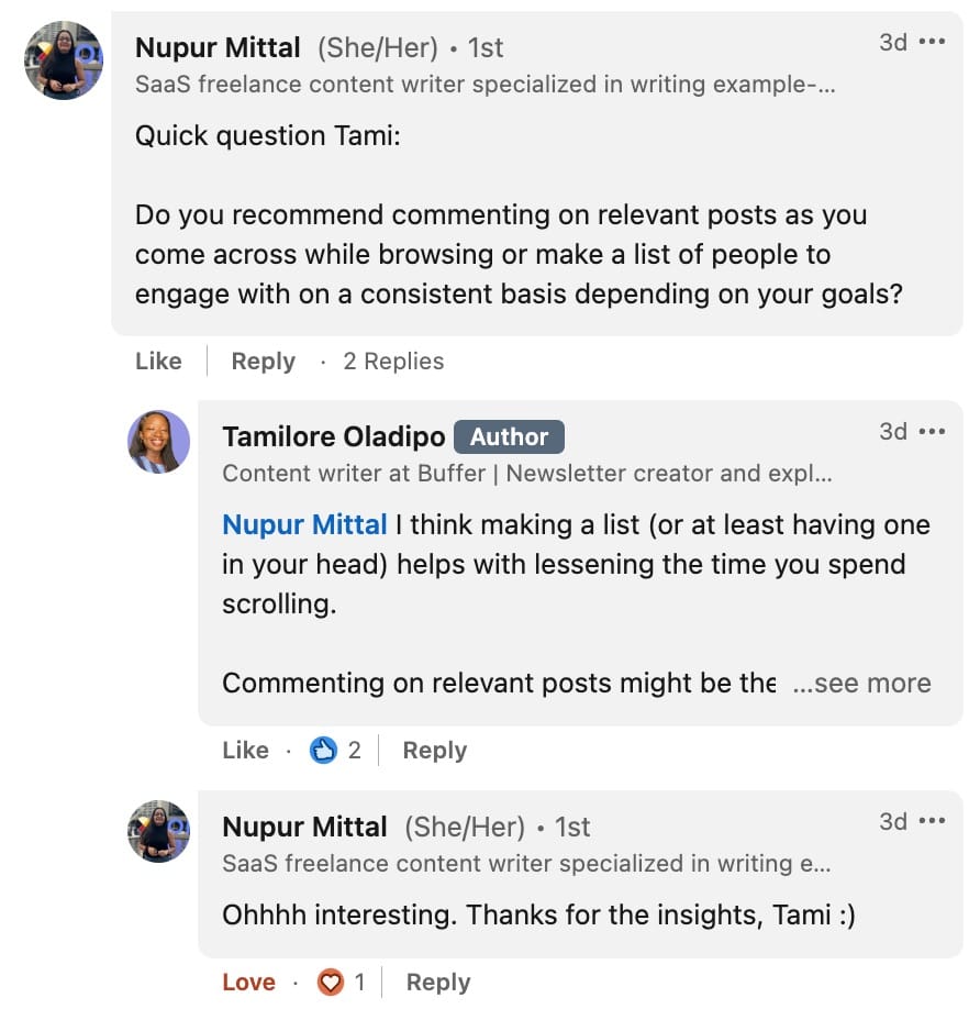
- Engagement went beyond my audience acknowledging what I wrote – the carousels fostered in-depth discussions and personal stories shared by the audience. Although you can get great interactions on any content format, in my experience, carousels seem to invite users into a narrative, prompting them to contribute their own experiences and insights.

Engagement on my LinkedIn carousel posts
- The payoff in engagement and visibility justifies the upfront investment in design and content curation. Carousels require less time than videos and allow more chances for engagement than single-image posts. This balance between effort and reward is crucial for anyone weighing the effectiveness of different content formats on LinkedIn.
Acknowledging the limitations of this experiment
While the results of our week-long experiment with LinkedIn carousels have been illuminating, it’s important to recognize the limitations of this type of experimentation.
- Small sample size and duration: This experiment was conducted over a relatively short period – two weeks, with one week dedicated to carousel posts and the other to text/image posts. The limited duration and the small number of posts mean that my findings might not capture the full spectrum of audience behaviors or the potential variability in engagement over time.
- Limited content diversity: The lack of variability in the content types means I don’t have insight into how the true spectrum of available formats might influence engagement differently.
- Audience behavior and time variability: I used our internal data to figure out the best time to post on LinkedIn and engaged with the comments under my post. These factors, along with things like what was happening with the algorithm that day, could have influenced the results of this experiment.
Despite these limitations, I hope this experiment works as a starting point for understanding the impact of carousel posts and encourages you to conduct your own experiments.
Invest in LinkedIn carousels
If you don’t take away anything else, remember this: LinkedIn PDF carousels are one of the most rewarding formats on the platform. Once you find your rhythm, they can be what skyrockets your audience size and engagement rate.
If you’re considering incorporating LinkedIn carousels into your content strategy, start with clear messages and simple designs. Focus on conveying your key points in an accessible and visually appealing manner. Experiment with different types of slides—mixing images, text, and infographics—to discover what resonates most with your audience.
Creating and posting your carousels is only half the battle. Engage actively with your audience in the comments to foster a community around your content. Finally, track your results and adjust your approach based on what the data tells you about audience preferences and behaviors.
What’s been your experience with LinkedIn carousels or other content types? Share with us in the comments!


